
Showing posts with label Colors. Show all posts
Showing posts with label Colors. Show all posts
Monday, September 3, 2012


Thursday, August 9, 2012

Thursday, March 29, 2012
Celebrating Colours : Flower Confetti
Each Friday I get fresh flowers from the market for our home. I like to have them around to welcome the weekend and they stay fresh through the week and make the home all cheerful and a happy space to be in.
I like to scatter them all around the house; kitchen and the washrooms included. And each time we choose a different "vase".A pickle jar, a beer mug, a tea cup, a trifle bowl, a biscuit tin..the list is endless ( Read an earlier post on this here and get some more ideas here).
But what I have observed is much as I like to experiment with the vase I always shy away from experimenting with the colours of the flowers. Its always white and whenever there is any colour I like to stick with just one.
The fact that we are celebrating colours here at purplehomes all this month is a good enough reason to do away with one colour and adorn my home with a confetti of colourful flowers.
Here are some colourful flower arrangements to help you, if you like me always go with white :)


Don't they all look gorgeous? I now do know what I am picking up from our neighbor flower market tomorrow :)
Friday, March 23, 2012
Celebrating Colours : Colourful DIYs
The weekend is almost here and my favorite thing to do over a weekend is to create lovely somethings for our home. All Handmade.
Here are some gorgeous, very simple and very very colourful DIY projects I came across. I hope they inspire you too.

A colourful doormat. Instructions here

A pipecleaner and yarn LOVE sign. Instructions here

A wind mobile. Instructions here

A birthday reminder chart. Must make. Instructions here

A fun crayon artwork to make with the kids. Instructions here
Create and colour this weekend. Love.
p.s.We are celebrating colours on purplehomes all this month:)
All image credits under each picture.
Tuesday, March 13, 2012
Celebrating Colours : Pantone Tarts
Sigh! And I die. Tart heaven.

p.s.We are celebrating colours on purplehomes all this month:)
Image : here
Monday, March 5, 2012
Celebrating Colours : Rooms I heart.

Drool. Those cushions. All that delicate and blue glassware.
p.s.We are celebrating colours on purplehomes all this month:)
Image : here
Friday, March 2, 2012


Monday, February 27, 2012


Wednesday, February 15, 2012
Turquoise meets pink and floral love.
Get ready for some pastel goodness.

Totally digging the solid stripes on the floor and
all that door that can be easily be handpainted.

Never a floral print person but they just seem to fit in perfectly here
and not so floral girl is liking it .

Do you see that crumpled linen table cloth and those bottles? awww...
Looks like spring is in the air.
Images : via pinterest here
Tuesday, February 14, 2012

Friday, April 29, 2011
Confetti garlands
I came across these darling paper garlands and I think they are all calling out my name, a bit too loud & clear if you ask me :) I love the colors and the way they come wrapped around handmade spools.


Seriously how cute is this! Pink confetti in her lil girl's room! 10 feet of dreaminess.

Recycled text garland anyone! Is this making your heart go flutter flutter? Wait till you see some more. Kristina Osborne creates these joyful beauties. Check out her store here.

Pick three??? I will pick all six. awww...how I love the greys & the yellow!
BIG fan of this palette and the peachy one too :)

Get some spring inside your home. A multicolored one with solid.
I could have this in my home all year round.
Friday, November 26, 2010
Colours make me happy!
I am surrounded by colours & paints these days. And so this post had to happen.
I am writing a colour story for a magazine for their January issue, working on a product development project with Akzonobel (ICI Dulux in India), getting the entire house painted (Its through Asian paints and my clients at ICI sure won't be happy if they see this post...so..ssshh) and tackling lots of paint based DIY projects at home. Paints, Colours, Swatches, Rollers, Brushes..heaven!
I was going through a color & trends report put together by the lovely team at Akzo and thought would share some of it here. Though let me warn you after going through the post you may be tempted to download the 132 page report (here)!

The colorful story begins with the Color of the year 2011. A "light, airy citrus yellow that symbolises a freer spirit, sense of fun and positive energy".

Do you like it? To me it represents sunshine,cheerful times, warmth, lemonade, lemon pies...What about you?
Every year ColourFutures™ works on one dominant trend and five relating trends. From this colour palette of these trends, the one color that best sums up is the Colour of the Year 2011.
For 2011, the dominant theme is 'Appreciation' "is - a time of acceptance and appreciation of things we so often take for granted; the mood of which we will see springing forth in confident yet relaxed trends for 2011"
What a beautiful thought. I like the way it fits into my plans for the new year as well. Working towards smaller things in life, appreciating the smaller moments in life and becoming happy, remember:) Which reminds me I must give you an update of the same sometime soon.
The five trends stemming from this are the beauty of everyday life, pop up pleasure, finding the way, made with love & molecular magic. Come with me for some gorgeous pictures & almost poetic renditions of the same through words.

"This theme harnesses the idea of local contentment, of satisfaction with what we already have as opposed to focusing on impossible goals and faraway solutions. It's about accepting real life, local pride and community respect where nothing is trivial or meaningless. In a world where everything can be visually pristine, digitally manipulated or graphically enhanced, this look represents a return to a universal sense of truth, honesty and harmony where things are simple and slightly imperfect.
This trend reminds us to revalue what we have, where the palette is relaxed and reminiscent of all things close to our heart, things we know well – blue skies, juicy fruits, country flowers and washing fluttering in the breeze. To live the moment and make it our own."

"This trend is about the joy of making something well as it is about the beauty of the end result - where the focus of attention has shifted from owning items to living better by making things.
Exchanging skills, working together and sharing the experience are qualities that connect people. Here, we see a valid rebirth of making things as a pleasurable, social experience; to witness the growth of knitting clubs, pottery classes or cookery schools.
This theme is not about 'loud' iconic design but one of quiet, creative pride and being truly 'green'. We now expect to know the full life cycle of materials and products. This more personal, responsible approach is a reaction against machines that can do everything, mass production, computer generation and inhuman processes. The love and care inherent in this theme will communicate beauty and quality - a true appreciation of the earth, its materials and creativity."

"This trend reflects the freshness of light zingy tints and clean pastels, grounded by typical cardboard brown. A single clean background colour can easily be accessorised by an array of pastel shades.
The idea of things that are transient and surprising is an engaging and charming one - a gentler humour and quirky creativity comes as a breath of fresh air.These refreshing spaces and places allow us to perceive things differently - magic from the mundane, poetry in the prosaic - to see them afresh, as if for the first time. They open up our eyes to the things that we have become so used to and learned to interpret in an educated way.Here, the magic is ageless, classless, and cultureless - a freedom of freshness."

"Defining directions, navigating life and understanding context are ideas that have a basis in both our personal identities and the wider aspect of where we fit into a globalised world.
Uncluttering our minds, homes and attitudes allows us to make sense of our immediate community and the world at large, where we can simplify and structure things. Mapping our homes via colour is a powerful way of decoding our environment. By accenting and highlighting certain areas it allows us to know and see where we are headed.We seek new directions and means of decoding who we are, where we are going and what our place in the world is. Inspired by signs, maps and urban architecture, this palette consists of pure, contrasting cool and warm neutrals highlighted by pastels from old maps and brighter signage shades."

"This microscopic, computerised palette is strong and alive - shades that grow, glow and pulsate with life and vitality in stunning greens, turquoises and purples that showcased against an array of subtle and understated deeps.
This trend is where the inspiration for tomorrow's cutting edge design is found, not by looking to distant lands, but to what is closer. Because we are so used to looking outward for inspiration, we sometimes forget to look closer at what is already here.As we look deeper we find unbelievable beauty often embedded in things that we consider to be destructive or unhealthy. This trend inspires us to no longer focus on the slick packaging of technology but what it can do for us. It's where the miracle of nature and its hidden, secret beauty will provide the new frontiers of tomorrow - a kaleidoscope of colour and pattern to fascinate all our senses."
I needn't mention that I am completely in love with each of the pages of the mammoth very well designed, researched & put together report. Its a visual treat both for the eyes & heart I tell you. If you want to spend your weekend browsing through it, download it right here.
Wishing you a colorful weekend! Be happy!
All images & part of text courtesy colourfutures.
Wednesday, November 3, 2010
Colour Crush : Red
This month I find myself loving more & more of red. Does this have to do something with my Diwali decor for the Big Day...hmm....may be :)

Ah! Waiting for the market to be flooded with strawberries...love that fruit.
Pretty red buttons..lots of them!

How sweet is this red lolly?
No.I haven't chosen this picture because of the vintage camera & the glam ballerinas:)

Now that one is my fav! Travelling in style! Cutesy style!
Images : 1,2,3,4,5 & 6
Friday, September 3, 2010
Color Crush : Aqua
It had been raining like crazy whole of the last week and the week before that. And I was lurving it. This week its back to sunny and humid and my heart is really missing the pitter patter...the lushness in my little garden, playing in the rain with my little one and drinking lots of hot coffee. So I am craving all things aqua right now.

Oops..someone rescue those aqua slip ons!
A clock to wake me please. I wouldn't mind that pretty package either!

Lots of blue thread for all those DIYS. Remember how in school these bands were such a craze.
I remember weaving them for my friends all night! How adorable are these raindrop envelopes!!

What an amazing new take on the headboard! a painted wrought iron one!
Old tins with flowers & lots of yummy paper...I am a fan of both!
What color are you craving this September? See my earlier Color Crush posts here.
Images : 1,2,3,4,5,6,7,8 & 9
Tuesday, August 3, 2010
Color Crush : Orange
I know its officially the season of mangoes but I feel like oranges. So orange it is!

How can one not fall for this tangerine cake and did see you that pretty orange bow? And how cute is that orange-bicycle! Wish someone served me food like this! And now one bicycle for the road!

I am really loving the contrast in this collage. The warm wall,the busy orange-fuchsia pattern and that lovely paper garland in the stark white bathroom. Hmm...I have a feeling my DIY list just had another addition!
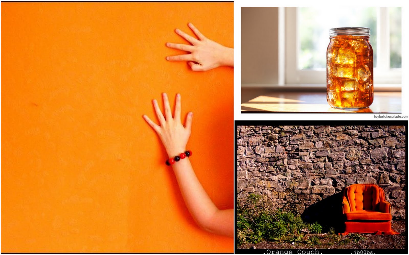
If only I could lay my "hands" on that jar of orange ice tea! Ofcourse the couch would be a great place to gulp it down!
Here's to a refreshing month ahead. I have lots of projects both professional & personal to finish. Wish me luck! And watch out this space for something really exciting!
Images : 1,2,3,4,5,6,7,8,9 & 10
Monday, July 26, 2010
A Cheerful home!
When I came across this lovely bungalow designed by Krista Ewart I couldn't resist posting these colorful & bold pictures here. I am sure some of you must have already seen this. So for those who have not come along & explore this cheerful space with me.

The couch here is to die-for! I could have never had the courage to use such a large print on a couch. But after seeing this living room I think I may just give it a try. I love how the pink and the orange is balancing it out instead of making it look all crowded. Did you see that art piece on the wall? So much color yet the room looks so collected.

Don't you just love the table cloth & the printed pattern on the dining chairs. Want to see the entire room?

Oh my god! I am smitten. That tortoise stool. All the green & the pink.Load of flowers.
Its just feels so fresh & energetic in here.

Now if this isn't the prettiest kitchen in the world I don't know what kitchen is! The pale pink refrigerator has left me all dreamy & speechless. I just realized I have this thing for pale pink fridges. Don't believe me? See HERE. The Keep Calm artwork echoing the same color, those gorgeous white stools. I'd like to bake all day & night here. Get me some vanilla please!
Want to see more of this space, click here.
Images: housebeautiful
Subscribe to:
Posts (Atom)